Engraved hand color map of double hemispheres on 2 sheets. Compiled by Jean-Baptiste D'Anvile. Engraved by Ignaz Abercht. Relief shown pictorially. (Metadata from the David Rumsey Map Collection)
In 1795, Franz Johann Joseph von Reilly published an atlas of the world. He called it (somewhat unimaginatively) the Large German Atlas. It contained 27 double-page engraved maps, complete with hand-colored outlining and title cartouches.
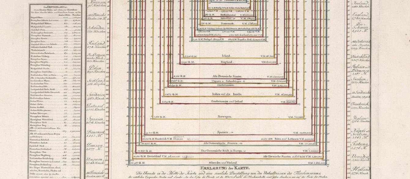
It is remarkable for being the first Austrian-made atlas of its kind. But the Large German Atlas offers more than gorgeous maps. It delivers an astonishing data visualization—cutting edge for its time, and masterful by today's standards. Von Reilly's invention is tucked in between maps of Europe and Asia. It offers readers a comparative look at the populations and areas (in square miles) of the states of Europe, including Russia.
If you are looking for a way to see Europe on the cusp of the great age of modernization, or hoping to get students to think about how populations change across time and space, check out the Imperiia Project's interactive edition. We explain how the visualization works and provide some tips on what to look for.
And fair warning: you might never see Europe the same way again.

Allegorical title page of the Grosser Deutscher Atlas


